Alerics Ice Cream
The revival of an iconic island ice cream brand, originally established in 1949
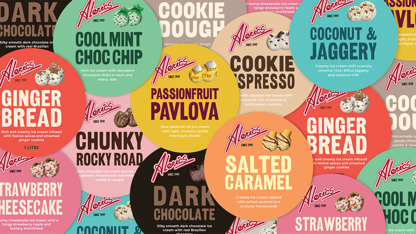
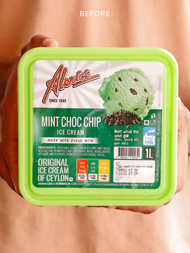
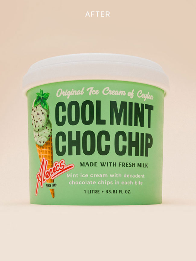
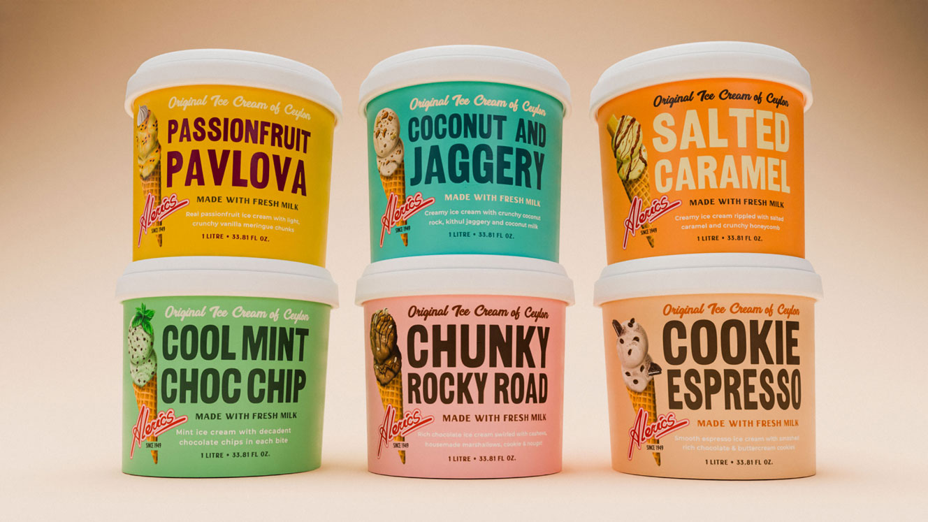
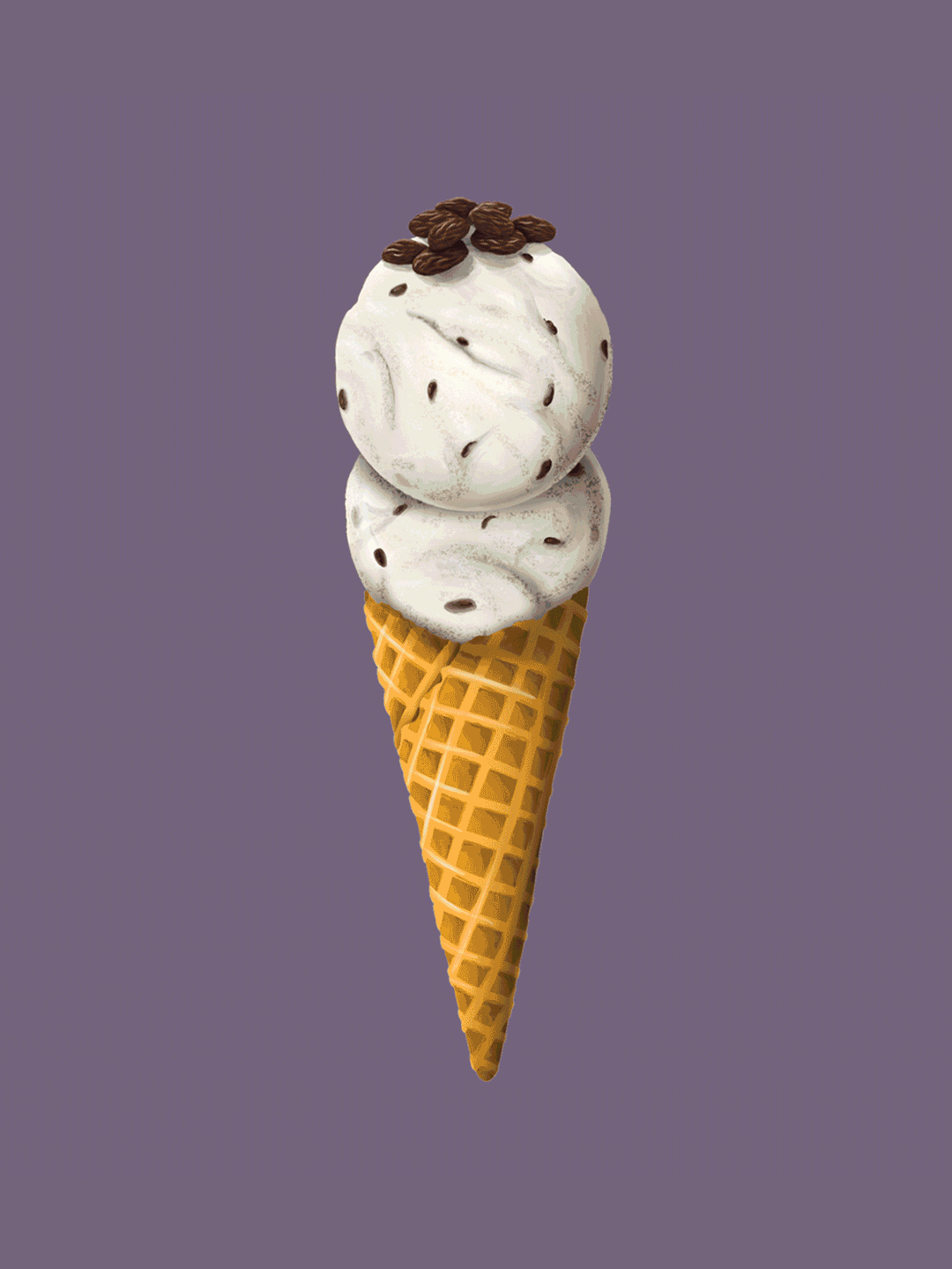
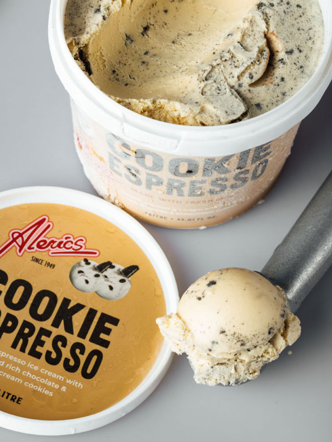
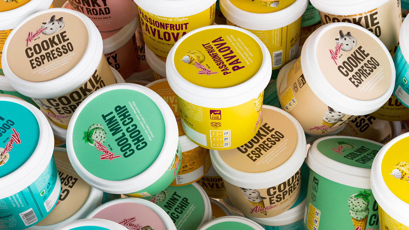
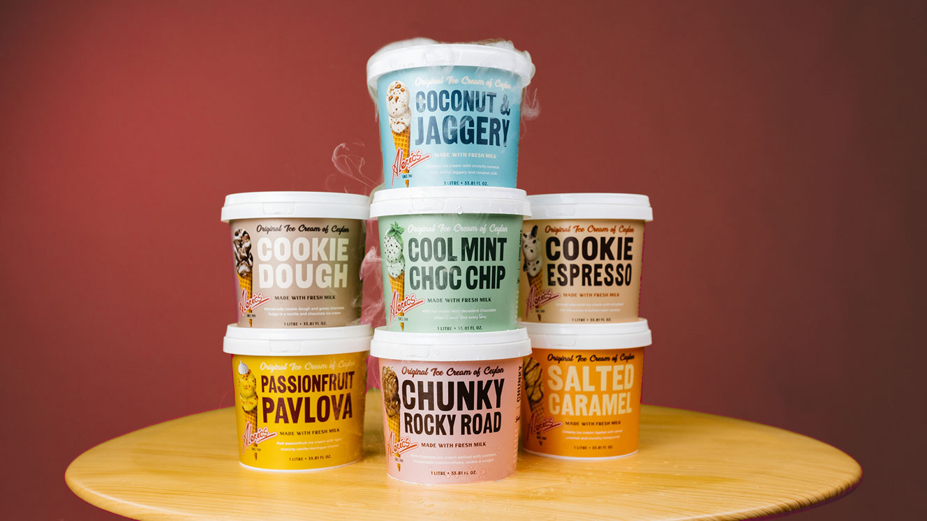
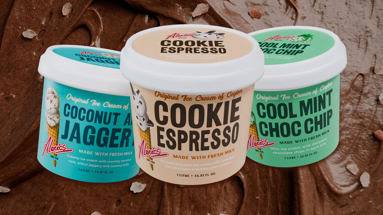
Once a household name, Alerics Ice Cream was a hugely popular brand in Sri Lanka until the 1980's when a new wave of larger brands flooded the market and Alerics fell out of favour. A fresh acquisition injected a new lease of life into the brand and word soon spread of its comeback. To capture both the original Alerics audience (40+), and a new wave of youthful customers, we referenced retro typefaces and vintage illustrations of 1950's ice cream parlour walls to create a range of playful tubs with a nod to the glory days gone by.
Packaging, Illustration

“After working with Studio Nice One we made some significant wins. The new packaging helped us differentiate our products from generic ice creams on the shelf. As it was modern and cool, it was exactly the brand identity we wanted to build. Our goal was to get more people to try our product and we saw a significant increase of new customers picking up the product and we experienced a 10% increase in sales”
NUWAN DE SILVA
Managing Director, Alerics