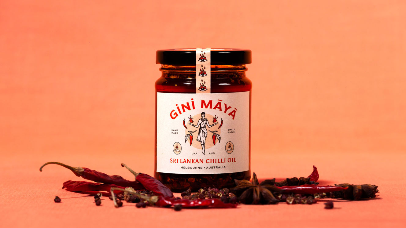
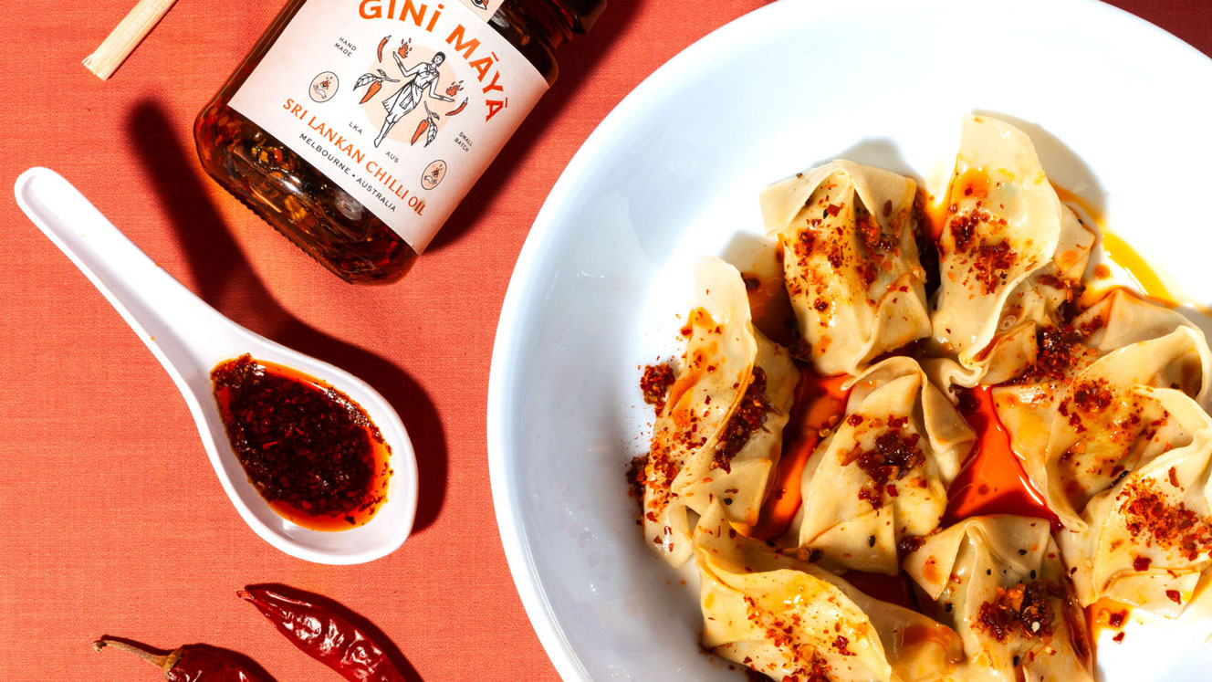
Gini Māyā Chilli Oil
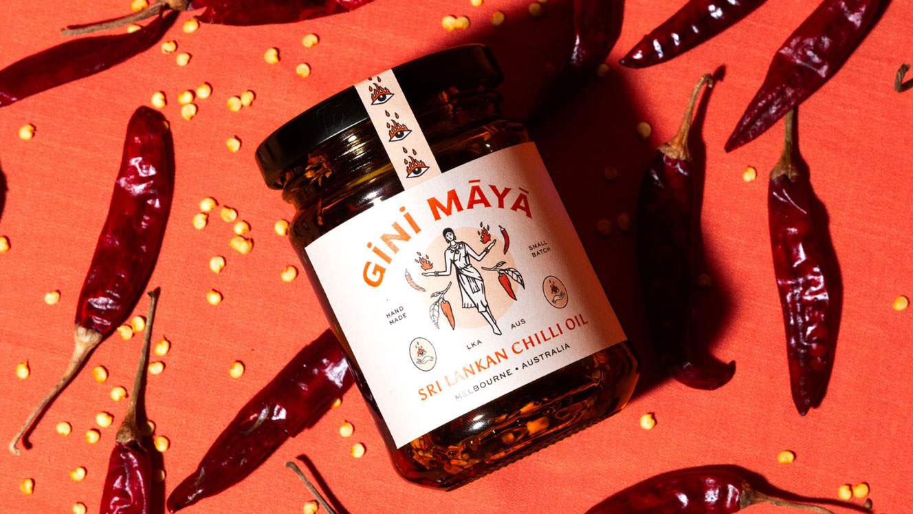
A Sri Lankan inspired chilli oil launched in Australia for a fiery kick to spice up meal times
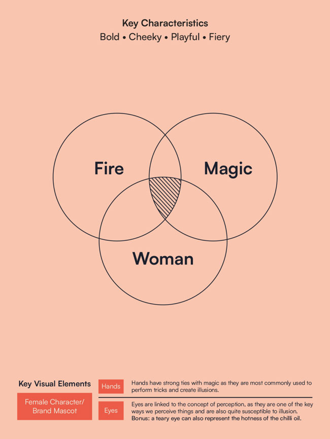
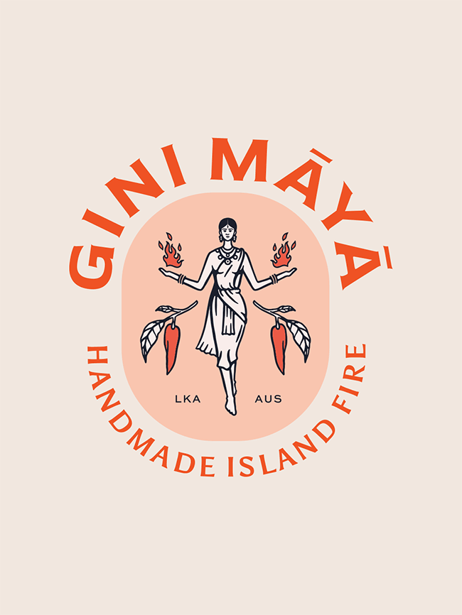
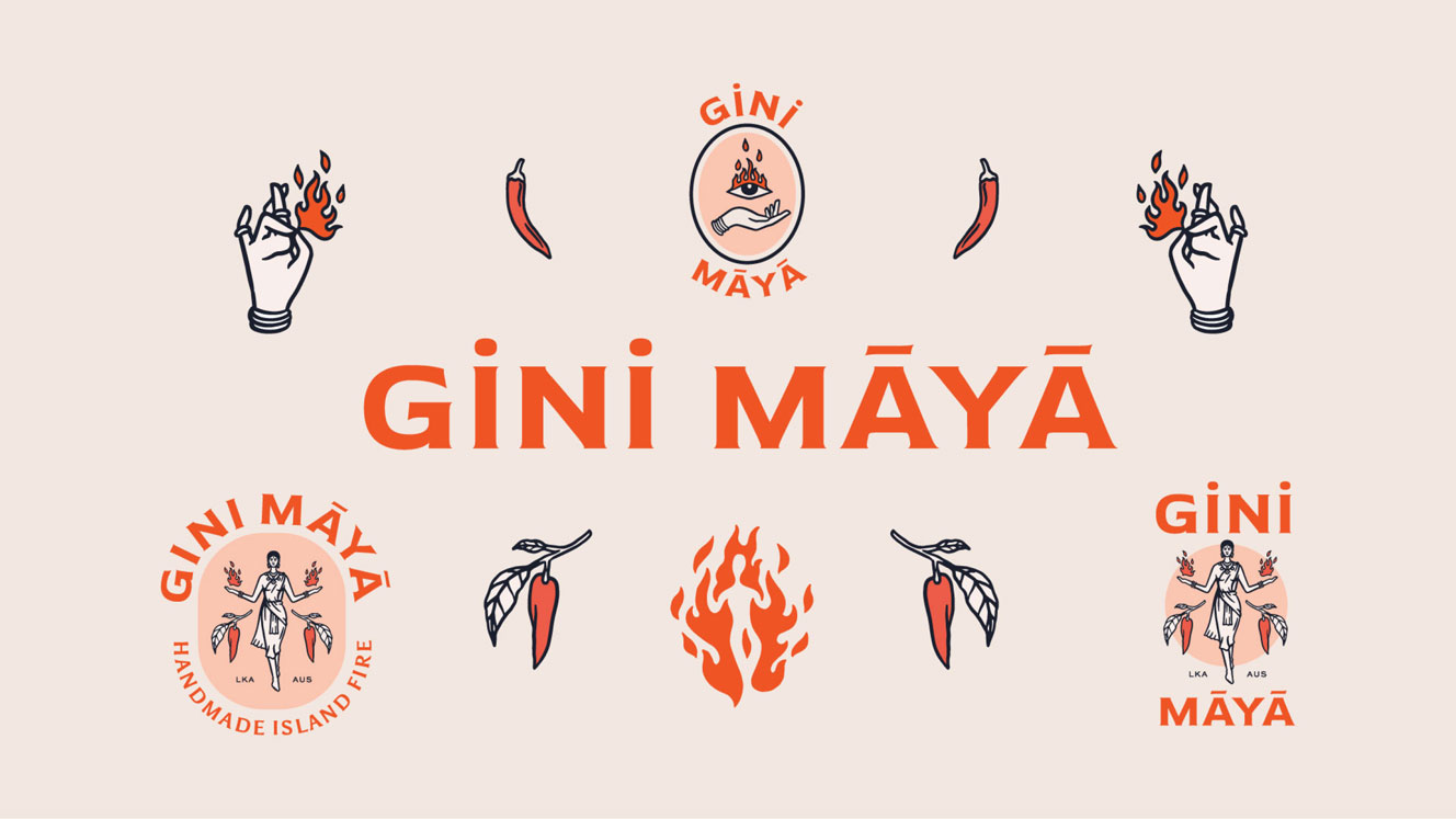
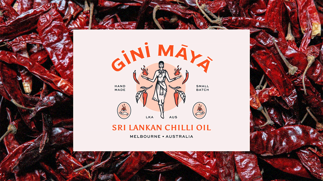
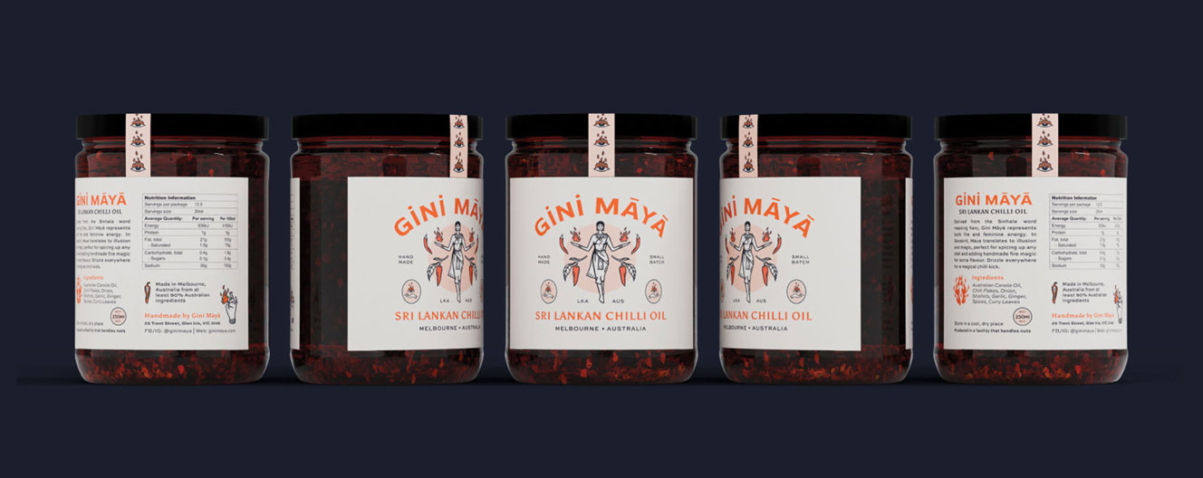
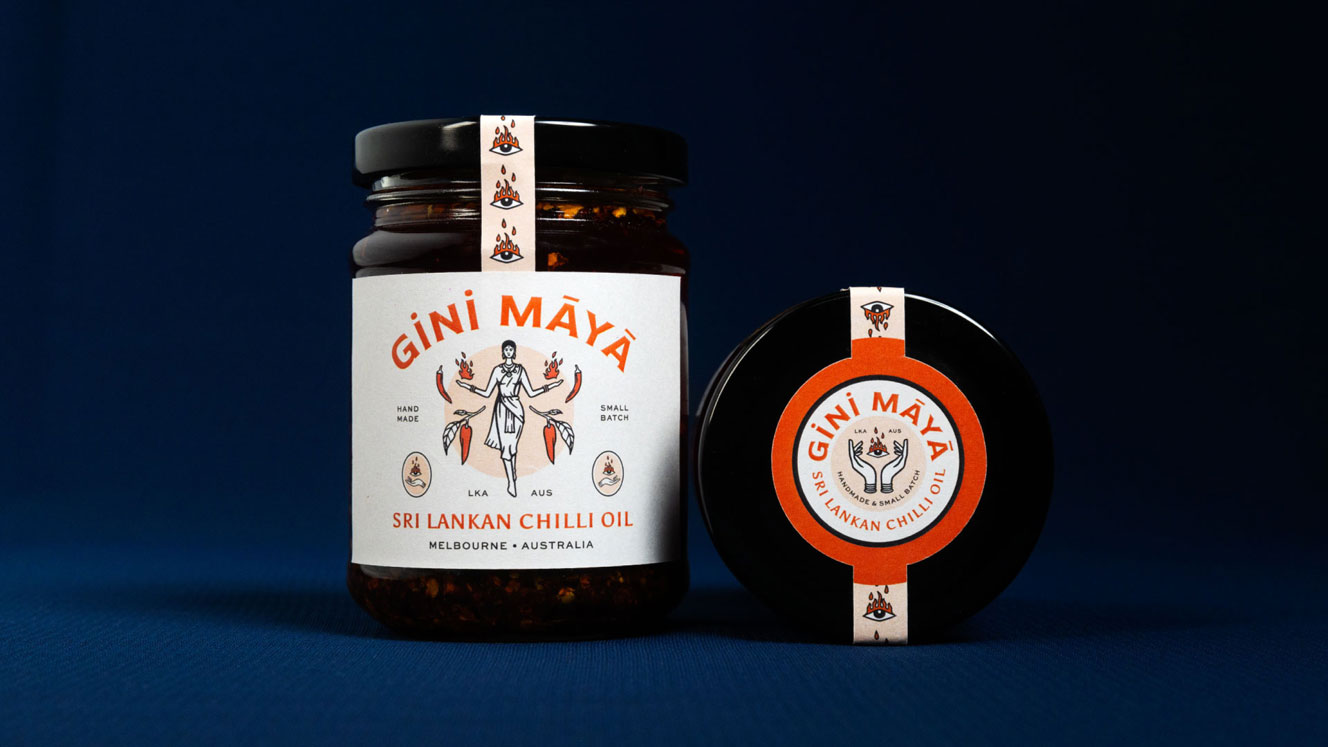
Derived from the Sinhala word meaning fiery, Gini Maya represents both fire and feminine energy. Launched in Melbourne by a first generation Australian, the brand's female founder wanted to embrace her Sri Lankan heritage and found a gap in a market dominated by Chinese style chilli oils. With one of the largest Sri Lankan migrant populations, the city of Melbourne is the ideal place to launch a premium product that connects the essence of Sri Lankan cuisine with the vibrant culinary culture of the city.
Branding, Packaging, Illustration
“SNO did an amazing job of branding and conceptualising Gini Maya for me. Right from the start the team understood my vision and all my specific requirements, and brought to life a brand identity that constantly gets complimented! I really appreciate the time and effort the team took to research the finer details and collaborate with me on each phase of the process. I’m thrilled with the final product. Can’t wait to do more with SNO in the future!”
Teruni Jayawickrama
Owner, Gini Maya