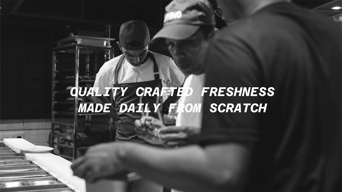
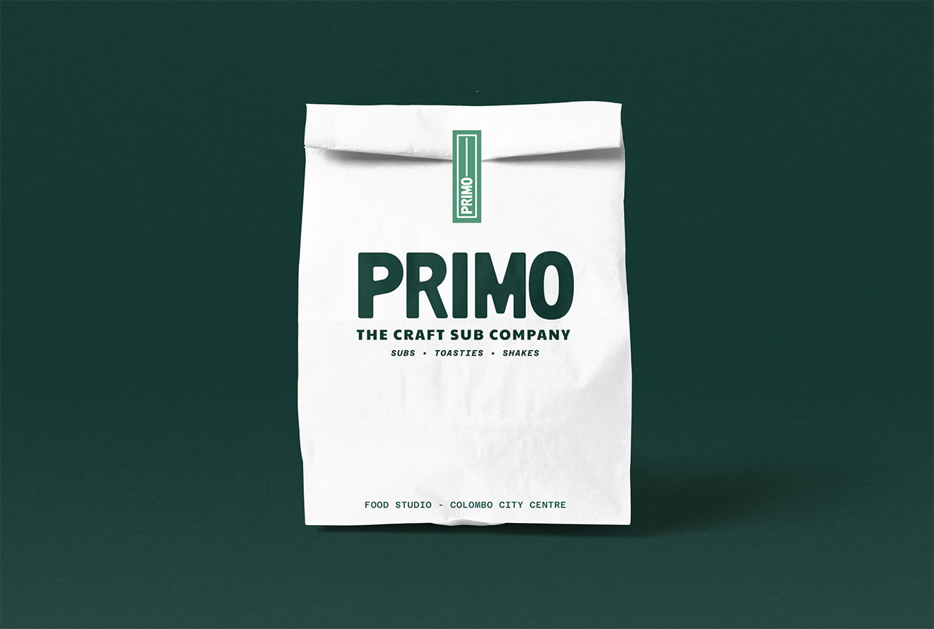
Primo Deli
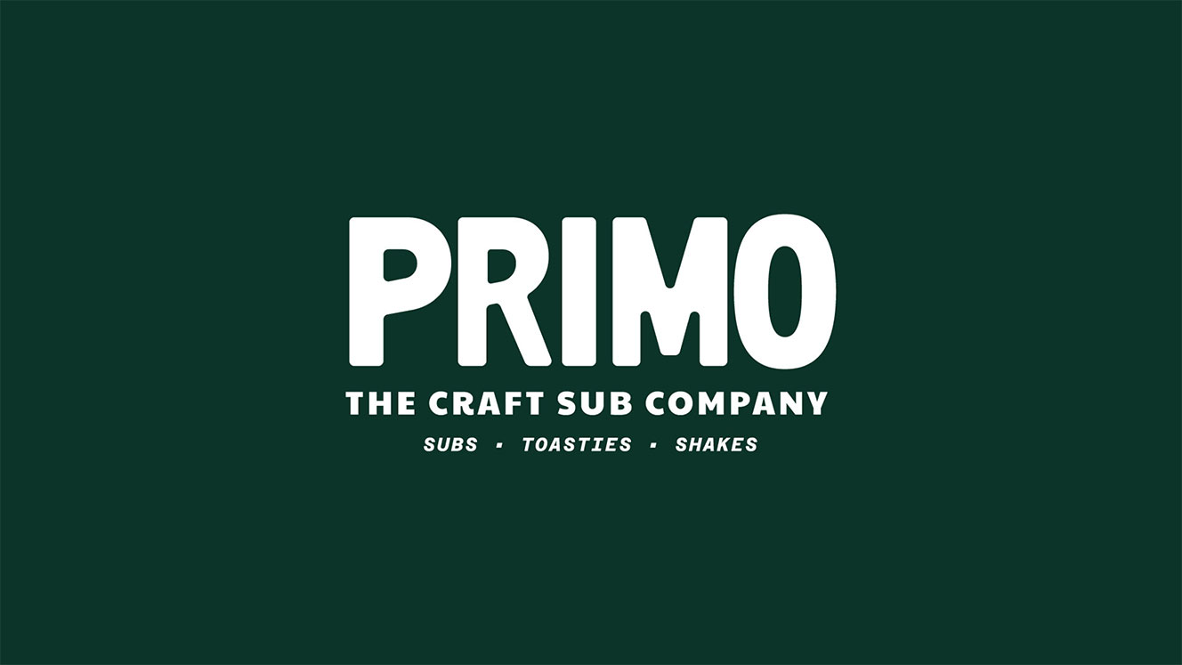
A new sandwich deli focused on high quality craftsmanship, inspired by the delis of NYC
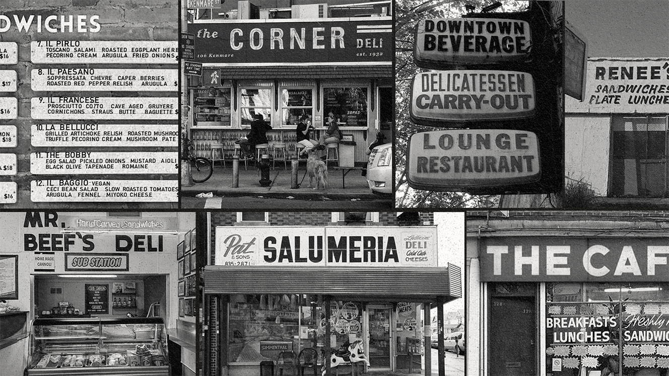
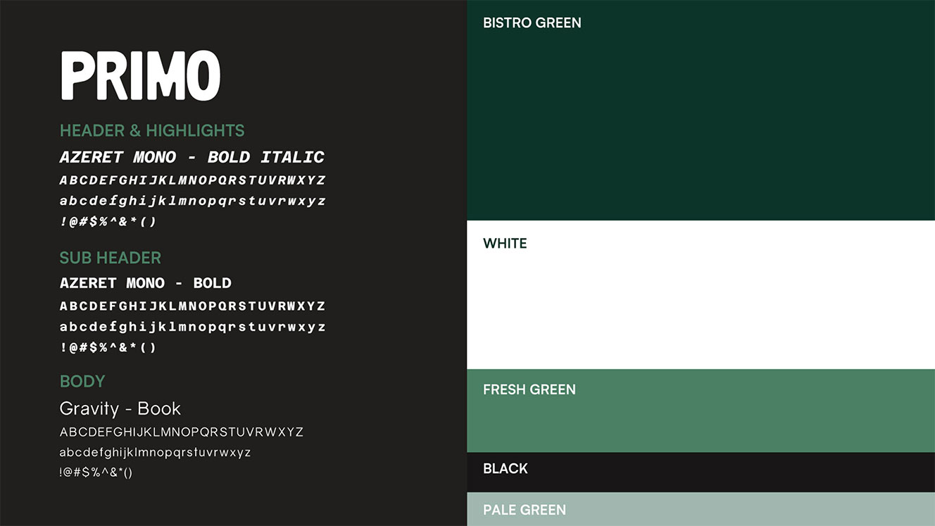
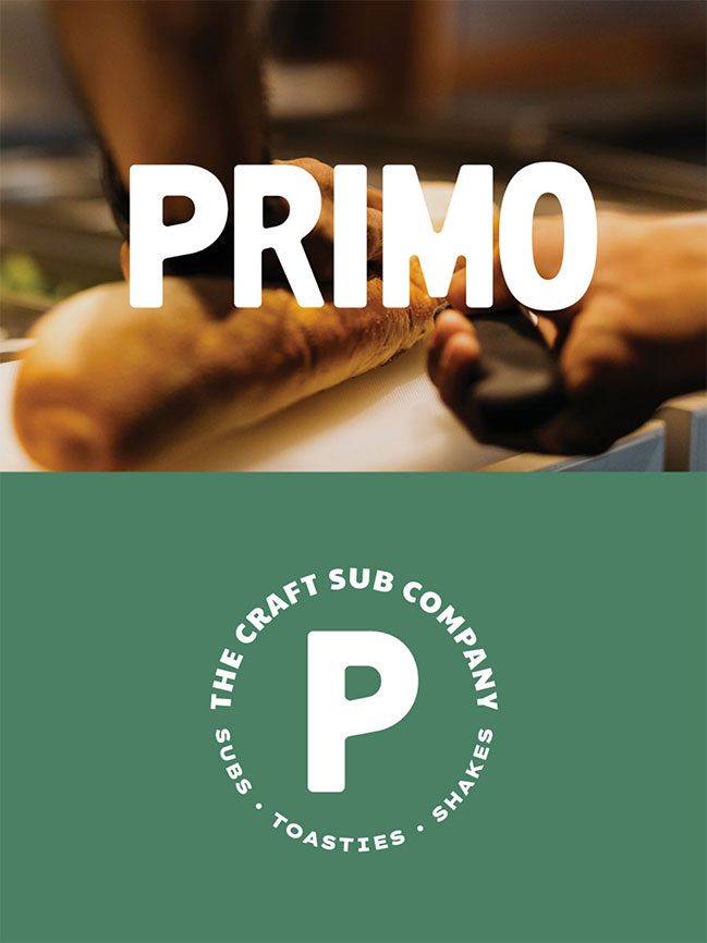
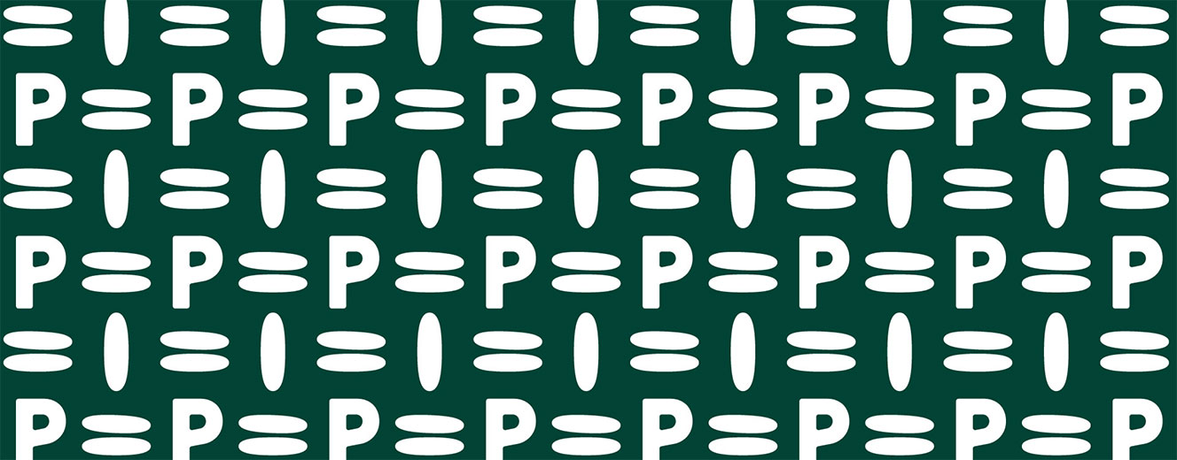
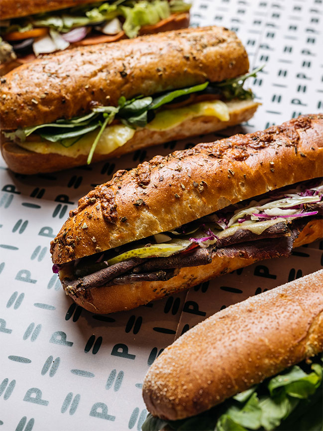
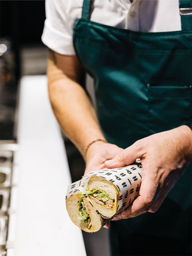
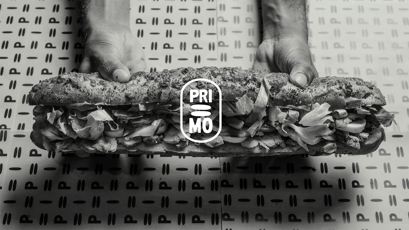
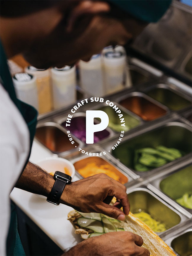
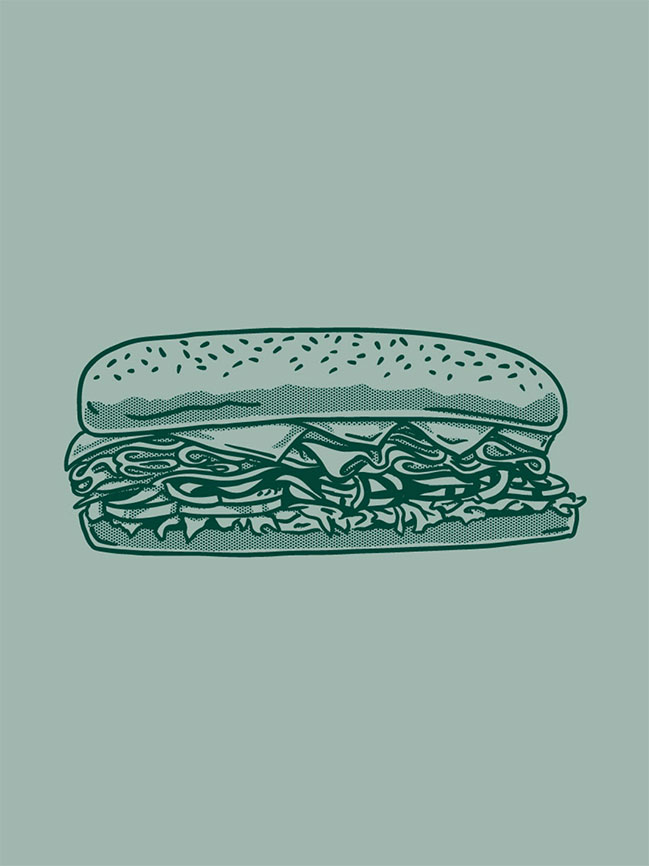
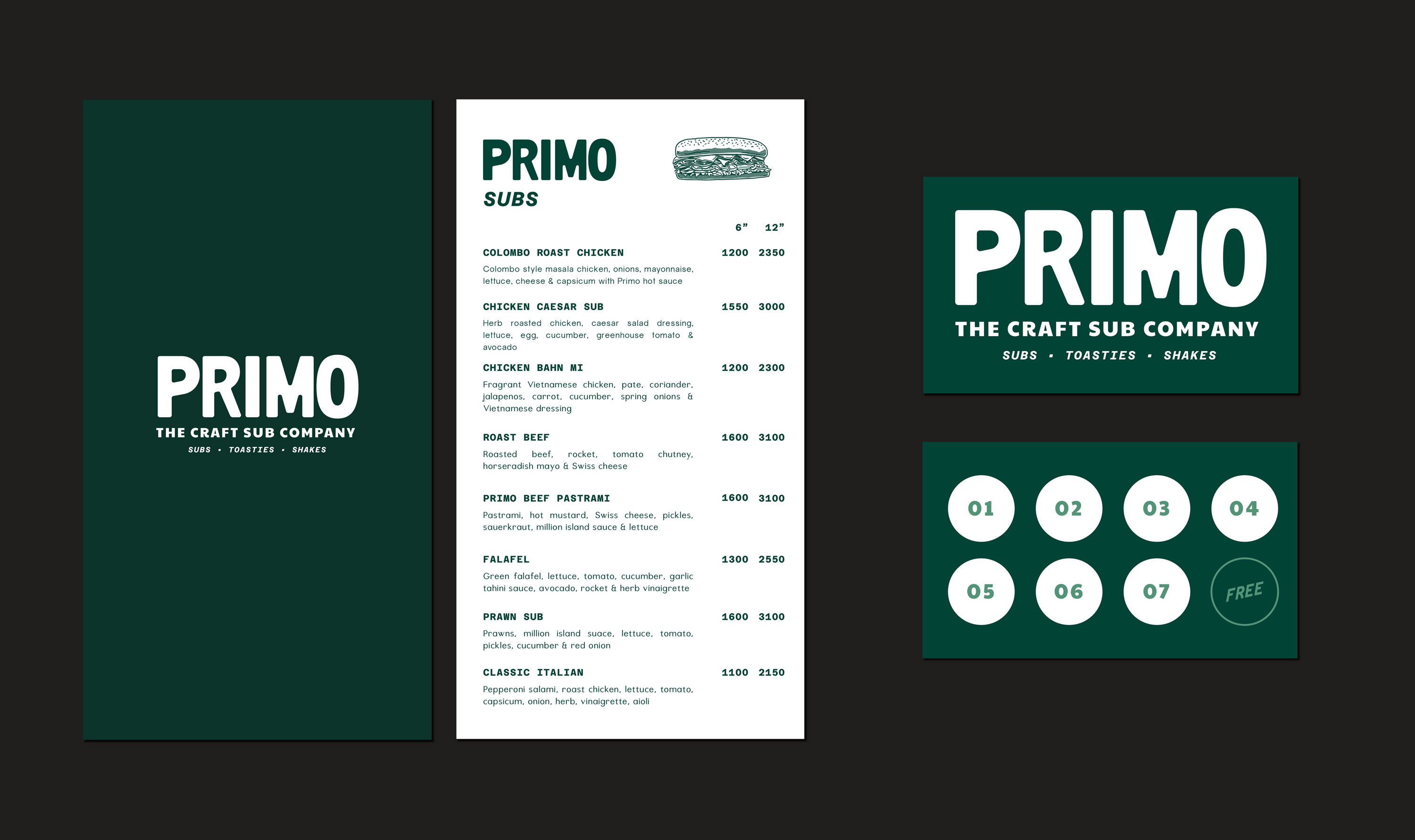
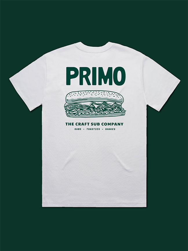
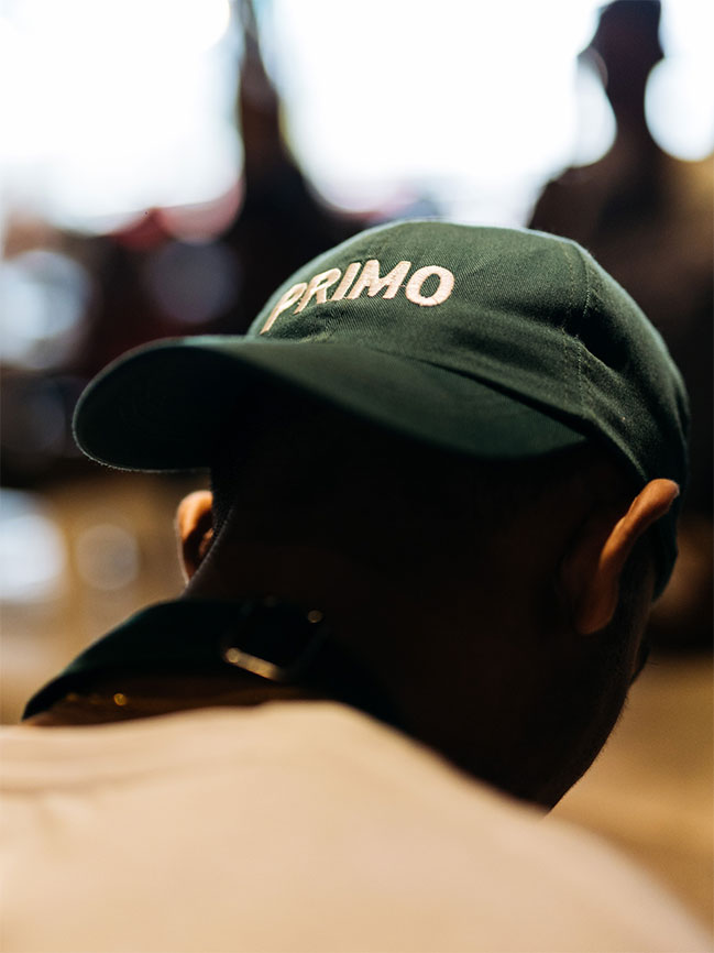
Primo was inspired by classic NYC delis, the kind whose craft has been perfected for decades to deliver a reliably delicious sandwich every time. We poured through images of authentic delis and signage to create our own in the heart of Colombo. With the Primo speciality being a submarine bun, we utilised the negative space in the word-mark to create a submarine icon, and applied this throughout the brand to keep things simple and appealing, just like the best sandwiches.
Creative Strategy, Visual Identity, Illustration, Brand Language, Packaging, Stall Design
“With SNO, It honestly feels more like a partnership than a traditional vendor relationship. Their commitment to user research and data-driven design sets them apart. Everything they do is personalized and created for us from zero. We always feel motivated and are constantly learning new trends and marketing concepts in the industry thanks to them.”
LOUZANNE PERERA
Food Studio Marketing Manager